Is Your Website Mobile-Friendly?
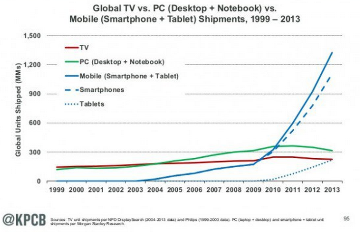
Newsflash: tablet and smartphone device access of websites is on the rise, while desktop/full screen monitor access is on the decline. Well, it’s not really a newsflash. It’s not really news, honestly. Do you remember the last time you took your laptop (or desktop) out to dinner with you to search for a fun place or thing to do?
In spite of all the obvious reasons to upgrade your website to be ‘mobile-friendly’, many companies still don’t think it matters. It’s not a priority. It works, changing it costs a lot of money. Our visitors can just do that pinch/un-pinch thing to see our content.
But the battle to be at the top of the search rankings – at least at Google – is about to change.
On a quiet day in February, Google posted that they would be changing the way their search engine ranks websites beginning April 21. They would now raise the ranking based on how mobile-friendly the site is – and effectively lowering the ranking of sites that aren’t.
Is your website mobile-friendly? Follow this link, type in your site, and find out. You are? Great, go back to work. You aren’t? What do you want to do about it? Your options are based on how your site was developed:
- If you have a site which was built by programmers, chances are you’re going to need to hire those programmers back to change it. They coded it, and without changing the code (or redoing the entire site) there is nothing cost-effective that you can do. It may be cheaper to have the site completely redone in a modern development tool.
- If you have a build-it-yourself site, you can go back to that host and see if they have a newer theme that you can migrate your content to. Yes, your site will look a little different, but you won’t be penalized by Google for having an old site.
- If you have a WordPress site, you get a few more options. There are ‘responsive’ themes out there that you could install. You may be able to leverage JetPack to achieve compatibility (though I will share that most sites look terrible with Jetpack because your site did not take mobile-friendliness into account when it was designed). The good news is that the bulk of your content will likely remain, but you will generally have to make some adjustments to full-screen images and slider-driven presentations.
If you need specific options for your site, I’m glad to be of service. Look, up there on the right, my contact info!